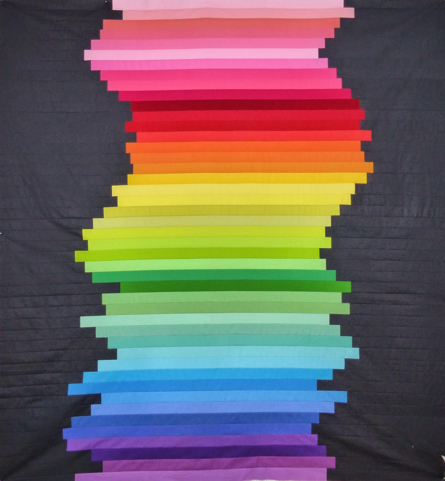
Up A Creek turned into this:
Hmm. I don't know. I'm very happy with the Charcoal background (the colours look better against it in person), but I think some work needs to be done to adjust the green and blue sections. They feel a little rougher than the yellow/orange/red sections. And possibly move the light pink to the top. Thoughts?


This is marvelous! So, will you be picking out and adjusting? Color and value come a little hard for me.
ReplyDeleteThis is the neatest!
ReplyDeleteThe subtle variations in colour just don't show on a monitor or screen, the way they do in person. I like the charcoal background and think you've used the perfect amount of it. As for the rest of your colours, trust and follow your instincts. You're a natural and the quilt will turn our beautifully.
ReplyDeleteThe colours look fantastic against the charcoal! Looking great!
ReplyDeleteThis is cool! I'd leave the pink where it is--it adds variety. Plus you have a couple other lights within darks in other areas. I might add just a bit more purple at the bottom to balance the pink on top.
ReplyDeleteI LOVE this! The colors really do pop against that charcoal background. Also, I think that I would leave the light pink and blues/greens as-is. I think the colors have great movement!
ReplyDelete:) Kelly @ My Quilt Infatuation
Yummy! Even though the light pink seems it belongs to the top I would leave it as it is as it balances the green and blue section.
ReplyDeleteOh I thought the rougher transitions were on purpose! I think they look great.
ReplyDeleteI love everything about it M-R! It's wonderful!
ReplyDeleteI think you have done a great job (again!)
ReplyDeleteYou have a wonderful way of putting a bit of a twist into your quilts. In this case just twisting up the regular ROYGBIV colour order just enough to give pause (and a little twitch to those of us who are a bit OCD!!)
I think it is amazing!
I like that it isn't predictable, because how many perfect rainbow quilts does this world need? I think you'll like it more once there's more texture in it with the quilting lines. great flimsy!
ReplyDeleteI agree with Brenda and like that it's a little random. It looks amazing so unless it's going to bug you I wouldn't change a thing!
ReplyDeleteHey there, another wonderful piece. I like it but if you are going to remove anything I think it is the aqua that doesn't have enough intensity.
ReplyDeleteBeautiful! The rainbow strips look really nice against the charcoal background! I think it looks great the way it is. I am working on a similar quilt in brights and I just ripped it apart because the blues/greens and pinks were driving me crazy! I'm regretting it a little now, because the transitions looked much less jarring in pictures. I also suspect that it would have been even less of an issue after quilting.
ReplyDeleteWhat a great quilt! You don't even need a paddle for this creek. I love solids and this is phenomenal.
ReplyDeleteWow.It`s absolutely stunning and love your design and fabrics combo!!
ReplyDeleteIt's a great quilt, I love the charcoal; the colours look fine to me but may look different in person.
ReplyDeleteThis comment has been removed by the author.
ReplyDeleteYou can move your strips around forever, and still not be satisfied. You have to decide when you've done enough of that. My only comment would be that it feels as if the green and purple sections are shorter than the ones higher up the creek. Did you run out of steam?
ReplyDeleteOh, see, I like it that way - it adds some texture when it's not a smooth transition between light/dark and the colours. And I love a good gradient - don't get me wrong - but I think this one is really lovely as is.
ReplyDeleteI like it as it is :)
ReplyDeleteI love it!!!!!
ReplyDelete