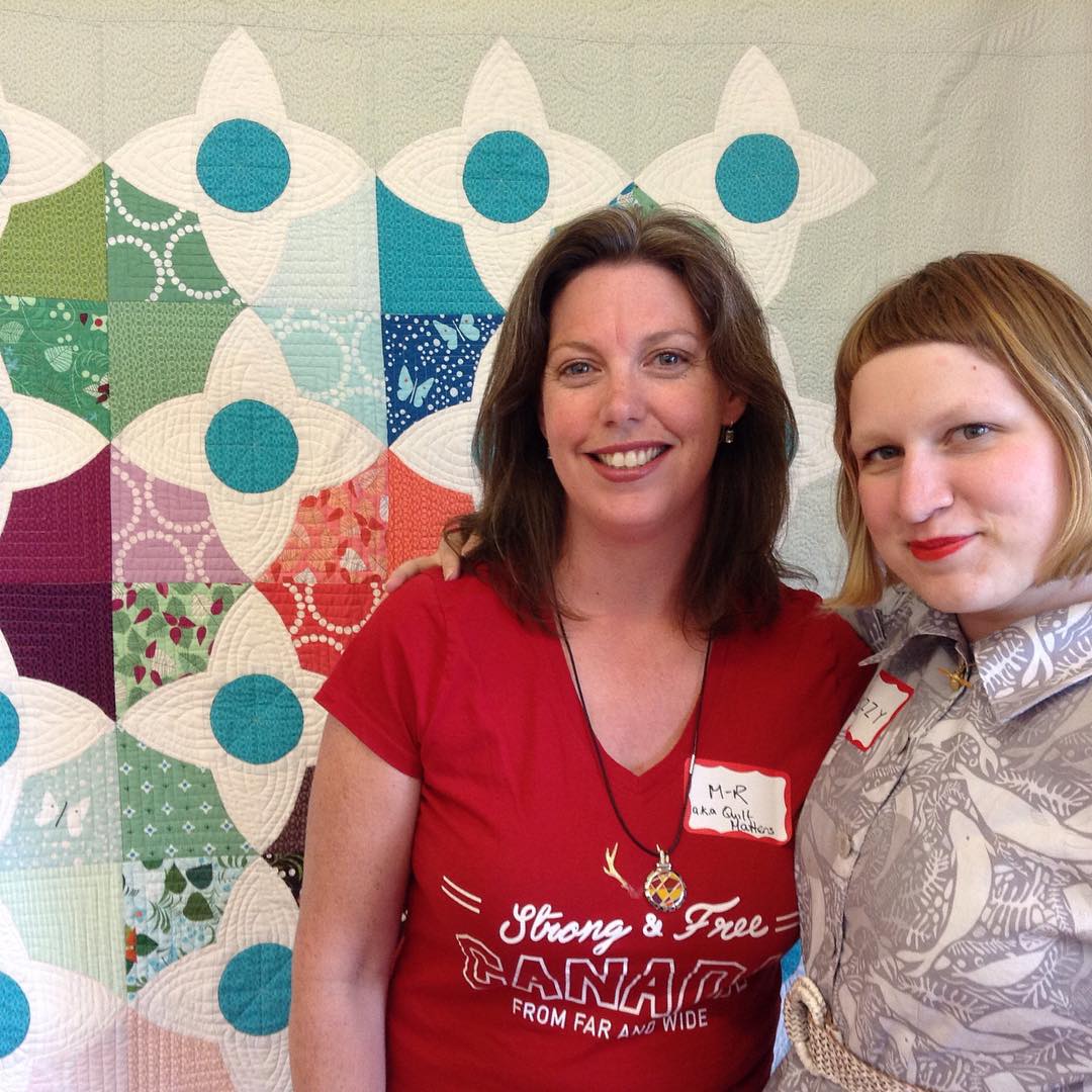
I wanted to meet her and take a workshop with her though so when the Ottawa Modern Quilt Guild (thank you, Laura!) brought her in to teach her Meadow quilt workshop, I signed up right away. Boy was it worth it! I learned a couple of new things and I've started what I think will end up being one of my favourite quilts.
Look! Me and Lizzy and her beautiful Meadow quilt. :D
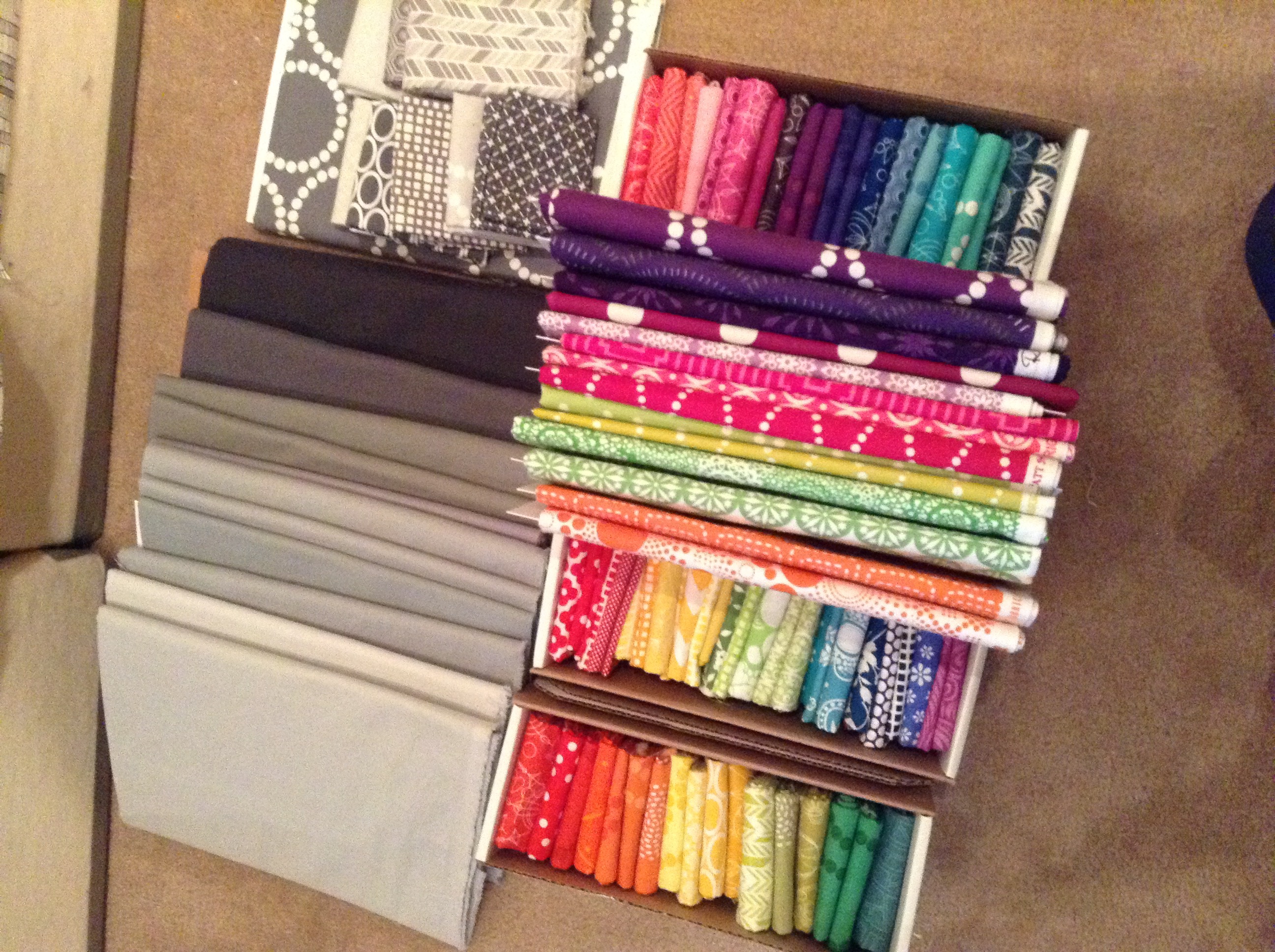
A couple of nights before the workshop, I did a fabric pull. Prints! Think there's enough Lizzy House fabric in here to earn me teacher's pet status or kickass?
My idea was to invert the design and see what it would look like if I made the stars/flowers with prints and do the background in greys. And I wanted to try playing with the values of the greys. Lizzy was very supportive of my plan and thankfully talked me out of one of my crazier ideas. :)
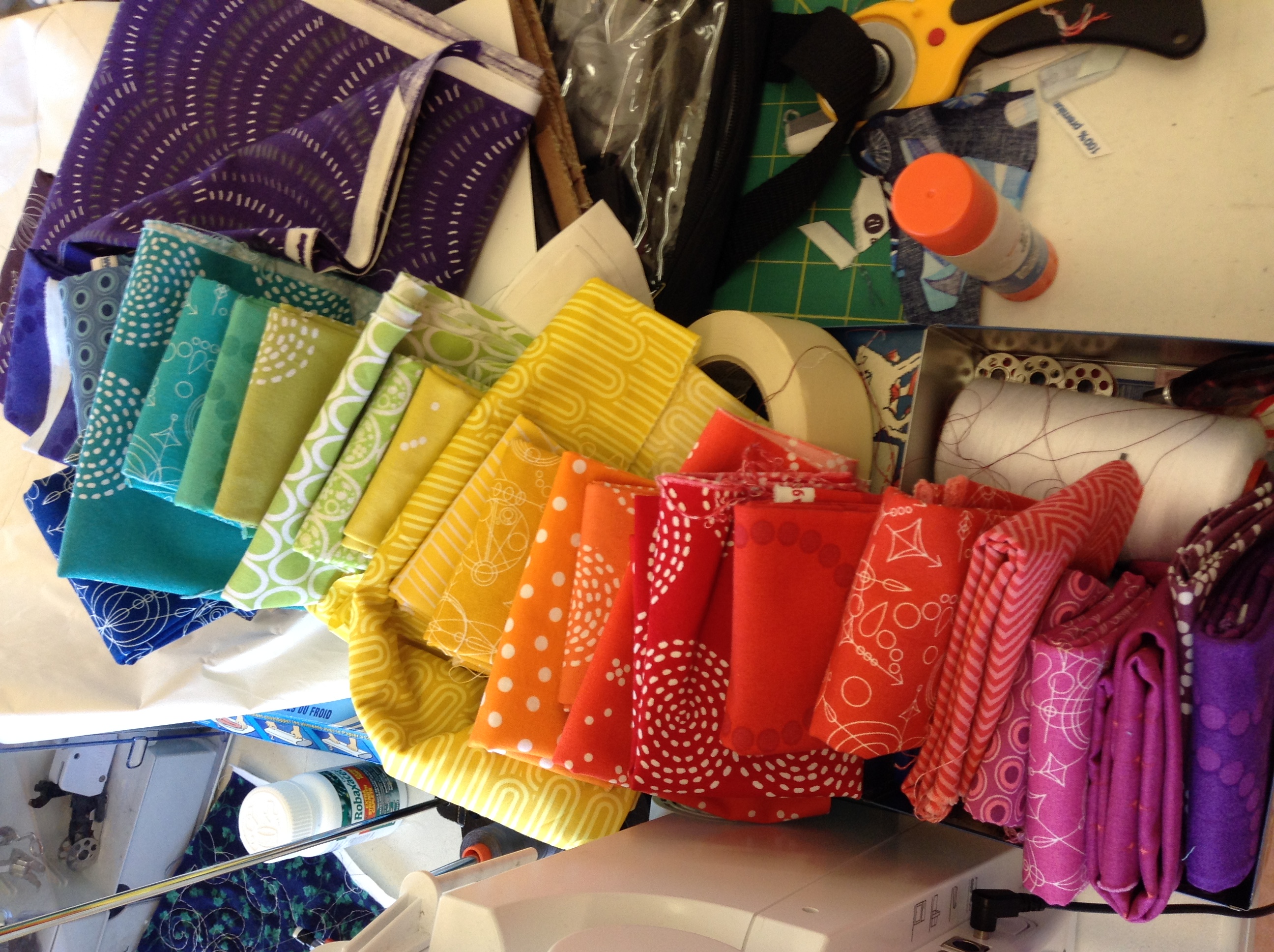
This is the fabric pull I settled on in the workshop.
Lizzy's Meadow quilt is a 4 x 5 block arrangement. Well, I had a hard time culling my fabric pull down to less than 28 so I decided to do a 5 x 6 arrangement.
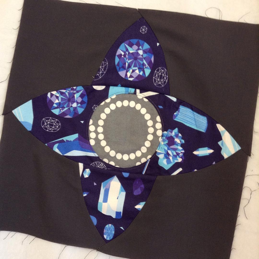
She's a smart one, that Lizzy. She had us do a sample block to test out the technique. Oh gosh, look at that, more Lizzy House fabric. ;)
My oldest son is a big fan of rocks and gemstones so this will become a cushion for him.
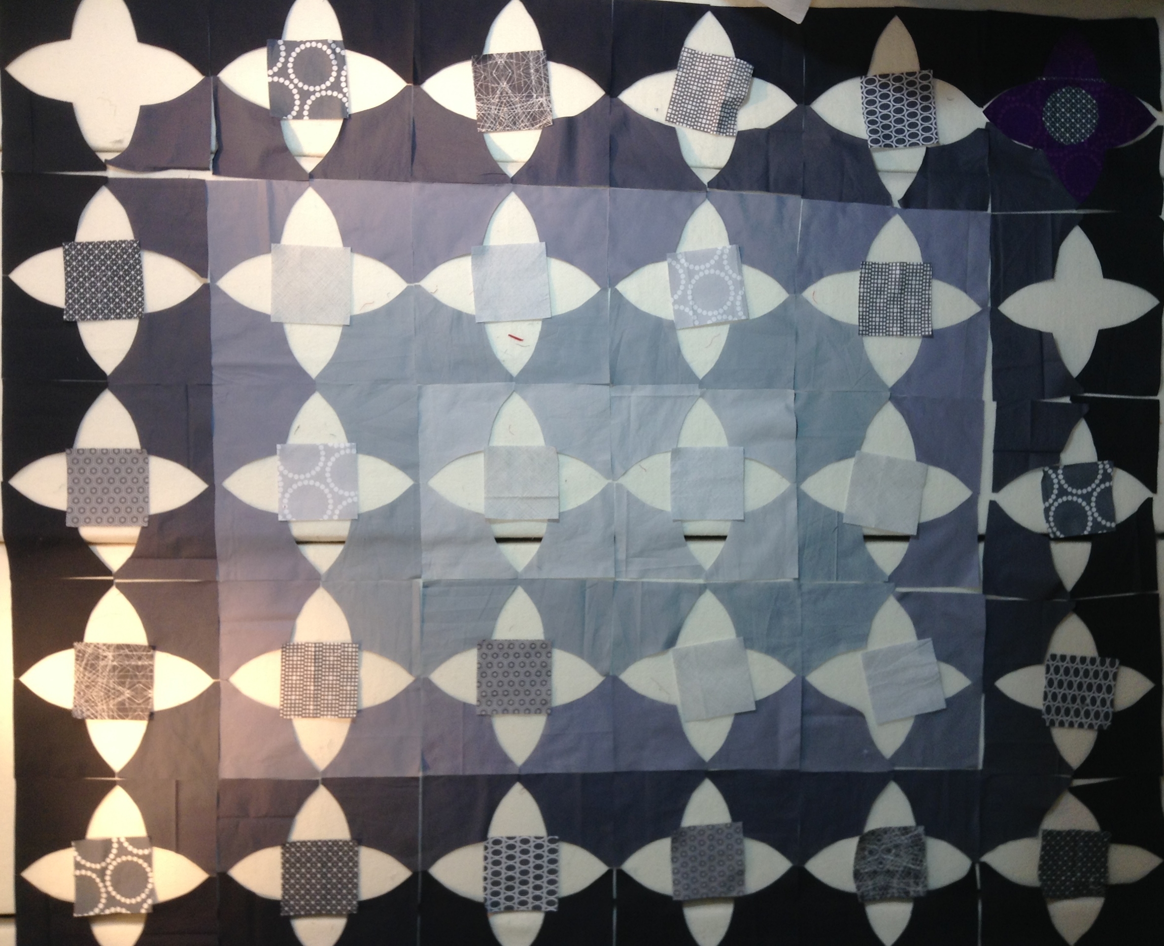
Playing with the values of grey in the background (sideways iPod shot).
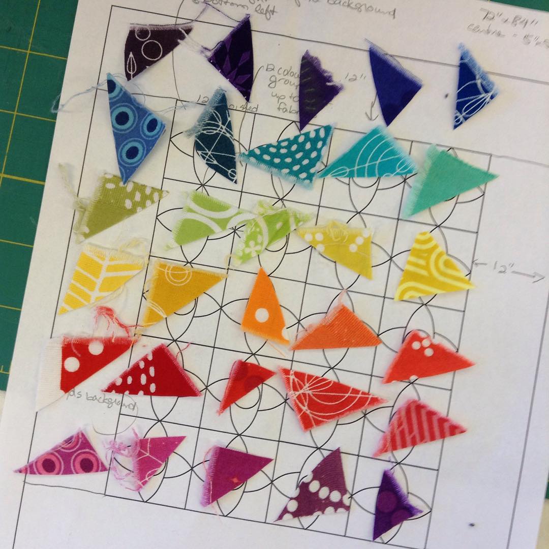
Now to check colour and value placement.
Option 1:
Option 2:
The cool purples in the upper right are bothering me. Replace one of them?
Option 3:
Option 4:
Now to decide on the background:
Option A: Having the greys in a value progression from darkest on the outside to lightest on the inside.
Option B: Have the values interspersed more randomly.
Going into this, I had thought I was set on Option A. Now, I'm not so sure.
Thoughts? Feeling a little decision fatigue here.



I like your version of this quilt. I'm leaning towards random but I think you should sleep on it and look at it again in the morning.
ReplyDeleteI once did a quilt with yellow friendship stars scattered over a starry blue background. I arranged the various starry blue prints from a light center to dark borders. It was not successful. The center simply looked faded. Good for you for trying your options on a design wall. Keep on quiltin'. Cwoosley12@yahoo.com
ReplyDeleteI like your final option the best--there is a nice contrast between the orderliness of the color arrangement of the stars (the foreground) and the randomness of the background. It creates a more interesting tension than when both are proceeding in a predictable way, I think.
ReplyDeleteBy the way--hooray for you, for thinking of switching it up in the first place. It looks great!
I like option B; it's more dynamic and the circles formed by the stars/flowers jump out and swirl together. I have to keep looking!
ReplyDeleteI can't say!! I looked at too many...but love this quilt!
ReplyDeleteThis is going to go down as one of the best Meadow Quilts in history! I am useless on helping with the colours, but I like the mixed up greys... whatever you end up doing will look amazing!
ReplyDeleteI'm taking her workshop this weekend and doing my fabric pull today! It's so hard to decide because I also want to do something a little different. I personally love your last option.
ReplyDeleteOh, lucky you to attend this workshop! I am head over heels with the last photo - it looks the most like rocks & gems t me!
ReplyDeleteUm, fabric envy goin on here, haha!
Wow, these options are fabulous. I like option 3 with option B for the background. I'm sure whatever you decide it will be stunning.
ReplyDeleteI think you have worked through the process and I vote for your last arrangement. And I might as well admit I have never heard of Lizzy House until now, but I like that your quilt will have your own flavour of her great design.
ReplyDeleteI think I like the last photo best. I love it when quilters think outside the box and switch things up with a pattern.
ReplyDeleteI think with the diagonal lean of the rainbow, the last (random greys) arrangement works the best. However with the initial gradation (dark to light greys), I would have used a vertical rainbow transition (top to bottom, with each row the same colour), because somehow there is a clash between the gradation and the rainbow the way you have done it. Beauty is in the eye of the beholder. I wonder what it would look like if you mirrored your photo...
ReplyDeleteThe last version gives a lot of movement to the design!
ReplyDeleteI much prefer option B. I have always loved the way you change this just a bit to make it stunning.
ReplyDeleteI love all the options, ha ha. You know rainbow and grey, combination I can not resist :)
ReplyDelete