It was lost, but now it is found. I'm kind of wishing it was still lost though. ;) This poor Work in Progress (WIP)/Unfinished Object/Train Wreck was started back, well, before the Millennium. Sadly, this is not my oldest WIP.
 |
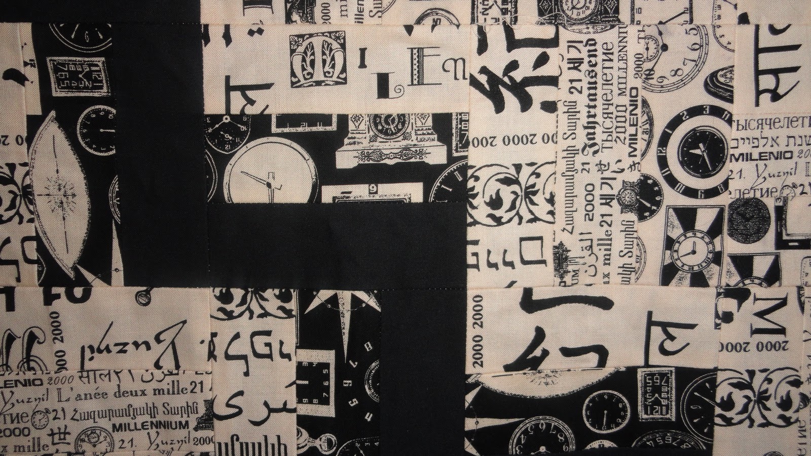
| I'd apologize for the picture quality, but a better photo really wouldn't make this look any better. |
This is a perfect case of fabrics from the same line don't always cut up and combine so well. Besides the solid black, there are four fabrics from a Karen Jarrar for Marcus Brothers Textiles line. There's a large scale beige and black print and a small scale beige and black print. There is a fabric that has black clocks on a beige background and another that has beige clocks on a black background.
 |
| Close up of the fabrics |
I thought difference in prints and scales would show better when they were cut up than they did. Even though there's a lot of contrast between the beige and black in each fabric, when they are cut up like this and placed together, they just really blend and the rail fence effect doesn't really work. The solid black rail fence really pops though.
So the question is how to fix it or make the best of it? Someone once suggested that I add a pop of colour, maybe some red applique. What would I applique though? Clocks? Use oil sticks to add colour? Hide this by using it as a backing? Let it get run over by my kids' schoolbus?
Well, even though we're almost 12 years past the Millennium (or 11 depending on who you talk to), I'd like to rescue this poor quilt and give it a purpose. Right now, I'm leaning towards using this piece as a large 'block' with a thin border of red (purple?), offset in a solid black background. I think that this would help focus on the black rail fence. I'm also thinking of using quilting lines that mimic the rail fence in black or red thread.
If anyone has any thoughts in this approach or ideas on alternatives, I'm all ears.
Happy Monday!


I think a pop of colour is just what it needs. I won a great book recently 'A Black & White Garden' it has lots of projects in B & W then flowers appliqued in colour. They look really stunning
ReplyDeleteHonestly?! I really like it as it is but then I don't know what you wanted it to look like!! I wouldn't add red - unless you want it to look really 80s?! I'd stick a black binding on it and call it done. Alternatively why not make a really colourful clock quilt top and make this the back?
ReplyDeleteI really like the appliqué idea and I am a big fan of red myself, but I think a different colour might be more unexpected. Bright orange? Bright Aqua/Teal? This has been hiding so long...Go crazy.
ReplyDeleteDom.