Thursday night and last night, I decided to sacrifice some sleep for peace of mind. I worked on my modern block for Monday, finished the baby quilt for my friend and made good progress on My Colour My World Purple Challenge.
I'll still need a day or so to finish up my Purple mini and as I won't be able to work on it again until Wednesday, I'll need to put the Purple linky party up on Thursday, instead of Tuesday. I hope those of you participating won't mind an extra two days. :)
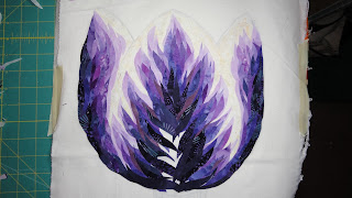
Now for the good news, I finished the tulip! Here where we were last:
Last night's progress...
I'm auditioning two background fabrics. They are both purple, but one is warmer, almost plum-like and the other is cooler. Both background fabrics are Nature's Studio by Lyndhurst. I used this same line on my From Light to Dark and Back Again. I'd love your opinion as to which background you prefer.
Option 1
Option 2
So what do you think?
I think this was well worth the sleep deprivation. ;)


That is one gorgeous tulip!!! Either background looks good to me - tends to stand out a bit more on the pinkier one.
ReplyDeleteGod I love your work.....you do the most interesting pieces. I would go with number 1 it shows the tulip up better...but both look great.
ReplyDeleteThis is truly beautiful. I prefer the second background but both look wonderful :)
ReplyDeleteThat's looking really good! I like both background colours, but the first one creates a bit more of a contrast to show off the tulip.
ReplyDeleteHope your son is feeling better!
ReplyDeleteYour tulip is gorgeous! I prefer option 2 for the background but they do both look great!
Fantastic tulip; I must try that technique sometime! I'd go with the first background; the contrast allows the tulip to really shine.
ReplyDeleteWow, that tulip is something! I like the warm (first) background, but either will be beautiful.
ReplyDeleteLove the tulip!I like the first background.
ReplyDeleteI like option one...it makes the flower glow.
ReplyDeleteIt is amazing!
number one background, but they are both beautifl
ReplyDeleteSometimes sleep deprivation is DEFINITELY worth it for the sanity factor. I think #1 is a bigger contrast for more pop- if you want it to match exactly the flower then #2. Both look good. Hope everyone feels better soon.
ReplyDeleteI love the first background. Brings out the purples better.
ReplyDeleteBackground #1 brings out the pinkier bits of the tulip and offers just enough contrast. Love it!
ReplyDeleteSo beautiful!! They both look amazing and I wouldn't be able to chose either!!
ReplyDeleteHope your son feels better :)
So kind of you to show the building of the tulip colouring. Fantastic! I'm for number 1 !
ReplyDeleteDefinitely number 1 - If you're going to spend so much time building a fantastic flower it would be a shame to let it fade into the background!
ReplyDelete